Volume 9, No. 3, Art. 38 – September 2008
Visual Research at the Crossroads
John Grady
Abstract: The author argues that visual methods are at the crossroads. They can remain in a niche or move into the mainstream by also addressing all people using visual materials. In the social sciences, visual methods encompass photography, video, and graphic representations. With respect to the visual, one has to note that all interpretations that are ontologically dependent on photography require more interpretation. "Looking at" means "being framed by," and this means also the picture maker who is also considered to be a viewer. For the social sciences, pictures provide us with personal insights as well as with a personal record of spatial and social relationships. On this basis one may raise questions like "how pattern variations occur over time?," "how are social processes organized?," or "what is the role of emotion in social life?" These are issues, the author continues, to which visual data can contribute. It may be added that methodological discussion should, however, besides the areas of visual data generation, analysis and interpretation also include solutions for the problem of communicating research findings. Some of these questions can be approached via controlled photo-observation, photo-elicitation techniques and imagery provided by the subjects themselves. Finally, the author turns to the question of what remains to be done? Here, he delineates three main areas: (1) evaluating the theoretical and conceptual basis of visual research; (2) creating public databases for the development and testing of theories; (3) defining "best practices" for visual research.
Key words: visual methods; photography; visual data; methodology; communicating research findings; photo elicitation; video data; interpretation
Table of Contents
1. Preview
2. What's so Special About Visual Data?
3. Seeing and Framing
4. What can Visual Research do for Social Sciences?
4.1 First, the organization of pattern, variation and change over time
4.2 Integrating levels of social organization
4.3 The organization of social processes
4.4 Emotion in social life
4.5 Displaying and communicating research findings
5. What Should be Done?
5.1 Evaluating the theoretical and conceptual basis of visual research
5.2 Creating public databases to develop and test theory
5.3 Defining "best practices" for visual research
6. In Conclusion
There is a paradox in contemporary visual research. On the one hand the enterprise is flourishing. Our shelves are overflowing with new products (or more appropriately, questions and applications) and our shops are crowded with customers (again, more appropriately, students and young instructors). Everybody wants to use the cascade of new technologies to investigate new sites with questions both old and new. On the other hand, the disciplines within which we work remain either indifferent, wary or, in some cases, quite hostile to our demand for entry and acceptance. [1]
They all have reservations about our data and whether it can produce valid information. They are not sure how representative our materials can be of any given universe. Finally, they distrust our interest in contemporary social developments and cultural expressions, suspecting that our intent is to celebrate what we study, rather than to carry out a dispassionate examination of the relationships and world they purport to represent. This kind of distancing from visual inquiry is especially true of sociology. [2]
This paradox has created an impasse, and it is this impasse that leaves us at the crossroads. There are two things that those of us who conduct visual research can do to surmount this obstacle. The first is to continue to grow and flourish, studying the social and cultural realm with all visual means at our disposal, deploying anything that promises to yield interesting results. The body of work that we are continuing to produce is steadily improving in quality and beginning to cumulate. [3]
The other thing that we have to do, however, is to confront the resistance we face more directly and to make an argument that persuades the established social sciences that what we do would benefit their fields of study. This paper will explore what I believe should be included in such a brief. [4]
I will proceed by addressing the following questions sequentially.
First, what makes visual data special and useful for the study of human affairs and doings?
Second, to what long-standing concerns in the social sciences might our work be expected to contribute?
Third, what should we do to strengthen the quality of our work to improve not only how visual research is viewed within our various disciplines but also what it has to offer? [5]
My paper concerns all who traffic in pictures and conduct visual research, but I am sure that their provenance from the village of sociology, as well as my local dialect, will be all too apparent. I hope you will be able to find them easy to translate, if possible, into the language of your tribes. In any event, the purpose of this paper is to encourage the widest possible dialogue. [6]
2. What's so Special About Visual Data?
By visual data I am referring to any, or all of, the following:
First, any visually perceptible object of interest to, or produced by, human beings;
Second, visually perceptible artifacts that record human doings of one kind or another. [7]
Visual data, therefore, includes all aspects of the physical universe that can be perceived, either directly or indirectly, like the representation of a landscape on one of the moons of Saturn produced by a remote sensing device (Figure 1).

Figure 1: Moon of Saturn (National Aeronautics and Space Administration, Courtesy NASA/JPL-Caltech) [8]
Visual data can also encompass material culture, like a mid-nineteenth century vibrator used in the medical treatment of women diagnosed with "nervous disorders." In addition, visual data may include various kinds of images and pictures that have been consciously constructed to either record or represent the world. The photograph of the vibrator in Figure 3, for example, is just such a record, while the vibrator itself is an artifact that can be visually inspected apart from its photographic representation. Generally speaking, visual research concerns itself mostly with these latter constructs, which I will henceforth most often refer to as "pictures."
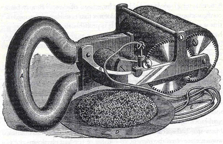
Figure 2: 19th Century Vibrator (MAINES, 1999, p.14) [9]
The social sciences generally use three types of visual imagery as evidentiary materials in inquiry and argument: photographs, video, and graphic representations in the form of charts and maps. For the sake of expediency, I will talk mostly about photographs, but much of what I will have to say applies to moving images and graphs. [10]
Pictures are one of the three major expressions that data used by the social sciences can take. The other two are numbers and words, which most commonly are derived from either a survey questionnaire, an entry in an ethnographer's field notes or as a transcript of an interview. [11]
Photographic data provides a more direct record of the actual events being investigated than any of the other major forms of data collection used by social researchers. They also capture the immediacy of the moment as it appears to the picture taker. Nevertheless, interpreting photographs, and pictures generally, often requires significantly more inference than other forms of data, because the analytic frame that is present in the interview schedule, or the chronological account of the ethnographer's observations, or the story telling strategy of the person being interviewed, is not found in pictures.
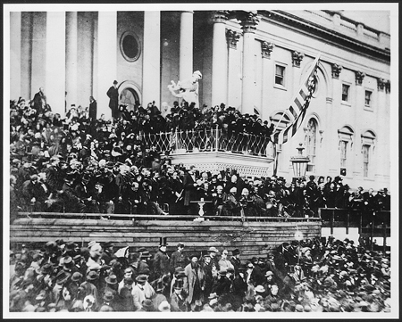
Figure 3: Alexander GARDNER: Lincoln's Second Inaugural 1865 (Library of Congress Prints and Photographs Division) [12]
Figure 3 is a reproduction of a photograph taken by Alexander GARDNER on March 11, 1865 at the inauguration ceremony of President Abraham Lincoln's second term of office. The speech was brief, just over 700 words, and is considered to be his greatest, a triumph of American oratory. [13]
What we see displayed in this picture, therefore, is about as close as we will ever come to what people who were present at the event witnessed and is an invaluable document. [14]
The picture, however, provides us with two very different kinds of information:
The first is what one particular person was focused on at that very moment, which is Lincoln delivering his speech, the honored guests around him, and numerous others who are standing in the periphery
The second is what we see depicted in a space/time coordinate, which includes an enormous quantity of information about, variously, what people were wearing, who they were near, how they were responding to his speech, some interaction and, of course, a few identifiable personages. [15]
This photograph has a poignant sadness because it was taken a month before Lincoln was assassinated on April 14th. Figure 4 is a second photograph, taken slightly before or after the one just shown. It is less well known because it was damaged by a fingerprint that blurs Lincoln's image at the center of the picture. Nevertheless, this photograph has interested scholars for what it might reveal about some of the people who were present.
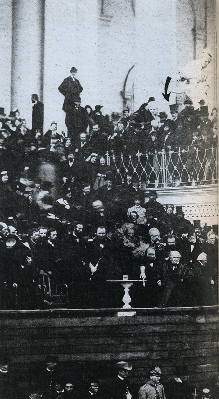
Figure 4: Alexander GARDNER: Second Photograph of Lincoln's Inaugural, 1865 (KUNHARDT & KUNHARDT, 1993, p.34) [16]
We know from other documentary evidence, for example, that the president's assassin, John Wilkes Booth, attended the event and reported that he was close enough to Lincoln to have killed him then and there. We also know that Booth's original plan was to kidnap the president. In fact, a bungled attempt to snatch Lincoln from his carriage failed several weeks after this picture was taken. Also, Booth only decided to kill the president a few weeks before April 15th, and did so without consulting a number of his fellow conspirators about the change of plans.
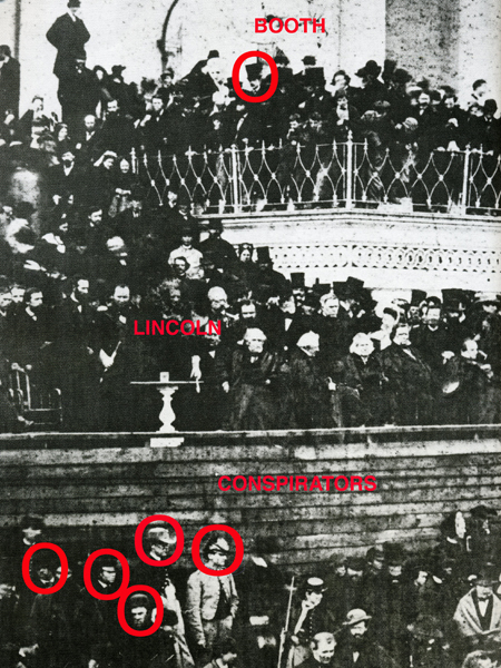
Figure 5: Alexander GARDNER: Lincoln's Second Inaugural with Booth and Conspirators Identified (KUNHARDT & KUNHARDT, 1993,
p.34) [17]
Some scholars believe that John Wilkes Booth can be identified in Figure 5. In addition, so can five of his co-conspirators. While there is corroborating evidence for Booth attending the inaugural, the only evidence for the presence of the others is provided by close visual inspection of this photograph and comparison with other portraits of the conspirators. Whether such a close look at the various pictures resolves the question is still debated by scholars of the period (Figure 6).
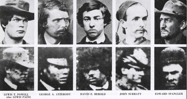
Figure 6: Contemporary Photographs of Conspirators and Images from Inaugural Photograph in Figure 5 (KUNHARDT & KUNHARDT,
1993, p.35) [18]
In any event, this much can be said about these photographs as materials for visual research. [19]
First, a particular person has taken two nearly identical pictures of a scene that engaged his attention. It is the inaugural address of a recently re-elected president who has led his nation through a war that is within weeks of ending in a decisive victory. It is probably safe to assume that anyone in GARDNER's position would have focused his attention on the president and the speech, although opportunity or aesthetics might have dictated a different vantage point. [20]
Second, the photographs constitute behavioral records of two moments in that event that were briefly separated in time and, perhaps, in place. [21]
Third, the photographs have sparked different interpretations, which are informed by subsequent events that neither the photographer, nor the crowd—including the conspirators and Booth himself—could have been aware of. [22]
Re-reading a picture, in this way, is usually taken as a warrant for the polysemic nature of pictures. The fact that a photograph can be interpreted in dramatically different ways is a very useful insight, reminding us that pictures have many lives and can sustain quite varied, if not divergent, meanings. It also effectively undermines a kind of "auteur" theory of photographic meaning that ascribes primacy to the intent of the photographer and, by extension, to what those who were photographed report about the event in question. [23]
There is, however, a very important sense in which the photographic act, and the eye of the picture maker, should be privileged. If the picture had not been made, it could never have been interpreted by anybody. Thus, while the meaning that the photographer ascribes to a picture does not have epistemological primacy over other views, it must be acknowledged that all interpretations are ontologically dependent upon the picture taker's moment of engagement with a subject. [24]
Normally, we see by scanning our environment continuously as we move through it. Seeing, however, is also characterized by moments of focused attention. Something catches our eye, we stop scanning, and look more closely in the direction of, and at, what attracts us. "Looking at" something in this way has the following properties:
What we see is framed by a rectangular shaped ovoid with an aspect ratio of about 5 to 3.5.
Objects are more visible the closer they are to the center of the ovoid.
This specific zone of clarity is roughly circular. [25]
Generally, most looking is extremely brief. Nevertheless, the act of looking can be quite intense, highly focused and last for a long period of time, depending upon how much the event interests the viewer. While most looking is initially involuntary, the one who is looking almost instantly becomes acutely conscious of the moment and of herself in that moment the more that she attends to an object. This is especially true if the object looks back and is another person. [26]
In other words, we physically "frame" what we attend to. This is a risky act as it deflects attention from those parts of our environment that we are no longer scanning. Of course, it is also risky not to look at what has caught our attention—be it a leopard, a speeding car, or a potential mate—because as an event it could easily and dramatically alter our life. [27]
The purpose of seeing, therefore, is to be able to look at what we should when we need to. Thus, the act of framing is a signal that something significant may be happening; it alerts us to the potential importance of an event. [28]
It follows that making a picture inevitably frames an event and the frame, which the resulting picture encodes, guarantees that it will attract the attention of a viewer for at least a split second. The picture maker, therefore, is first of all a viewer. She frames the picture by her own act of looking and her motivation to realize the event often involves finding more and more to interest her in the scene. We are able to align ourselves to the picture and the events it depicts because, in a very real sense, someone else—the picture maker—was aligned to the scene when she made the picture. [29]
As viewers, we recognize the event through the eyes of another and so are able to look at the scene in the photograph as though we were there in some very immediate way. The meanings we attribute to the photograph may be uniquely our own and have little in common with what the photographer might think the picture is all about, although this divergence is often less marked than current opinion allows. In any event, in looking at a picture we share the experience of engagement with a subject. It is similar to what happens when someone shouts, "Look!" and everybody "looks." It is this shared experience that entitles us to query what we see in pictures and expect an answer in response. It is what makes visual research possible. [30]
Reduced to a nutshell, pictures provide us with two very different kinds of information, indissolubly united by a single act:
first, a personal record of affective engagement with a scene that
second, produces an impersonal record of actuality and behavior.
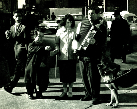
Figure 7: Andre KERTÉSZ: 6th Avenue,1959 (DYER, 2005, p.27) [31]
Andre KERTÉSZ' photograph of a scene on 6th Avenue in New York City aptly illustrates this point (Figure 7). It is complexly layered and could mean many things to many people. For our purposes, however, note the young man in the upper left hand corner of the photograph. The exchange between a short person and two blind people has caught his eye as it has the eye of the photographer, except that the photographer's "framing" of the scene has also included a record of the young man's framing of it from his vantage point. The image in the "mind's eye" of this young man may, or may not, have been quickly extinguished. KERTÉSZ', however, will last as long as the representation itself does. Nevertheless, both the photographer and the young man in the picture evidence a shared human propensity to look at what "catches" the eye. [32]
This dual aspect of a picture establishes the epistemological basis for two very distinct kind of information that visual research offers the social sciences, and which as a consequence suggest where it may be applied most fruitfully.
First, visual data are a record of spatial and temporal relationships and invariably raise the question: why here and now and not there and then?
Second, visual data record how someone responds to an object or event, and address the question: what do I feel about what I am responding to? [33]
4. What can Visual Research do for Social Sciences?
If visual data are uniquely suited to inform us about our spatial temporal surround and how we respond to events, then there appear to be five areas of longstanding concern in the social sciences that would benefit most from using visual materials as data. These include finding ways of adequately describing and accounting for the following:
How pattern, variation and change are organized socially and culturally;
integrating levels of social organization;
how social processes are organized;
how we respond emotionally to events; and
how research findings should be reported most clearly and effectively. [34]
Let's look at these in order. [35]
4.1 First, the organization of pattern, variation and change over time
Much contemporary social science consists of:
Identifying patterns, whether ideological, cultural, social or behavioral;
determining how weak or strong they are;
ascertaining the role these patterns play in people's lives;
establishing how one set of patterns is related to, or correlated with, another and so on. [36]
While different disciplines recognize different patterns, they are usually interested in them for the same reason: as a reflection of how human affairs are organized.

Figure 8: Earth at Night. Astronomy Picture of the Day (National Aeronautics and Space Administration, Courtesy NASA/JPL-Caltech)
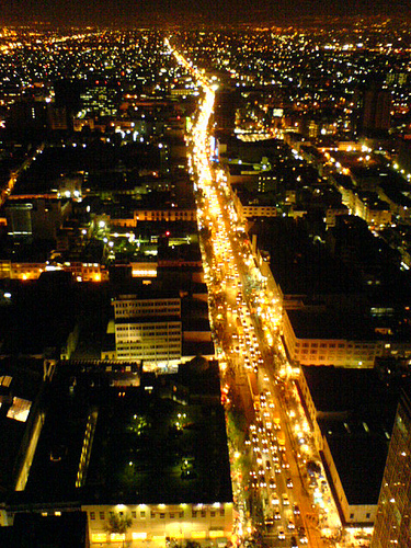
Figure 9: Steve CALCOTT, Mexico City Traffic, 2008 (http://www.flickr.com/photos/stevec77/87374852/)
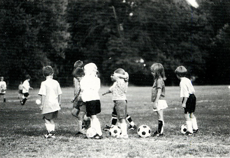
Figure 10: Children's Soccer League (STEIBLING, 1999, p.133) [37]
Social patterns can be discerned at virtually any level of social organization, all the way from reflections of settlement and energy use that are visible in satellite photos of the earth at night (Figure 8), to traffic flows through an urban thoroughfare (Figure 9), to children lining up during soccer practice (Figure 10). Almost invariably, when a pattern is identified it is hard not to notice variations and anomalies of one kind or another in the picture. A closer look at this soccer practice, for example, reveals that boys and girls occupy different sections of the line. It is out of such patterns that generalizations are made, modified, or discarded in favor of a more discriminating pattern, or none at all. [38]
In addition, many events that cannot be photographed can still be visualized. While both photography and video contribute much to the study of pattern and variation, graphic designs of various sorts have proven to be particularly useful. [39]
Pictures produced by a Geographic Information System (GIS), for example, display pattern and variation at the micro, macro and virtual level that turn the usual approach to investigating social patterns on its head. Instead of searching exclusively for an algorithm, or generalization, that generates or "replicates uniformity" in a lawful fashion, the goal is to create a model that, in A.F.C. WALLACE's apt phrase, "organizes diversity" (1961, p.26). The beauty of visual displays, therefore, is that they reveal underlying patterns in the data while preserving variation. Edward TUFTE summarizes this property well when he says:
"What is to be sought in designs for the display of information is the clear portrayal of complexity. Not the complication of the simple; rather the task of the designer is to give visual access to the subtle and the difficult—that is, the revelation of the complex" (1983, p.191).

Figure 11: Counties Where Racial Minorities Constitute over 30% of the Total Population. US Census 1990 (Map by John GRADY)
[40]
Figure 11 is a map that displays the distribution of the major racial/ethnic groups in the United States in 1990. Any census tract that is shaded in a color—blue for Blacks, green for Hispanics, yellow for Amerindians and Asians in red—is populated by 30% of more of that racial/ethnic group, revealing dense concentrations of racial/ethnic minorities with long histories of settlement. Blacks are located disproportionately in the "black belts" established by the slave system of plantation agriculture. The Hispanic area in the southwest is comprised mostly of territory seized from Mexico over 150 years ago. A relatively small Amerindian population is spread over large "reservations" established by various treaties. Finally, a larger Asian population is discernible in west coast cities. [41]
Displays like these should be inspected much as paintings are: thoroughly, attentively, and patiently. The general patterns remain intact even as a more detailed investigation reveals regional patterns nested within larger patterns. Anomalies aren't hidden in such displays; rather, they clamor for attention and analysis.
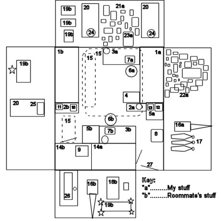
Figure 12: Student Map. Wheaton College (MA)
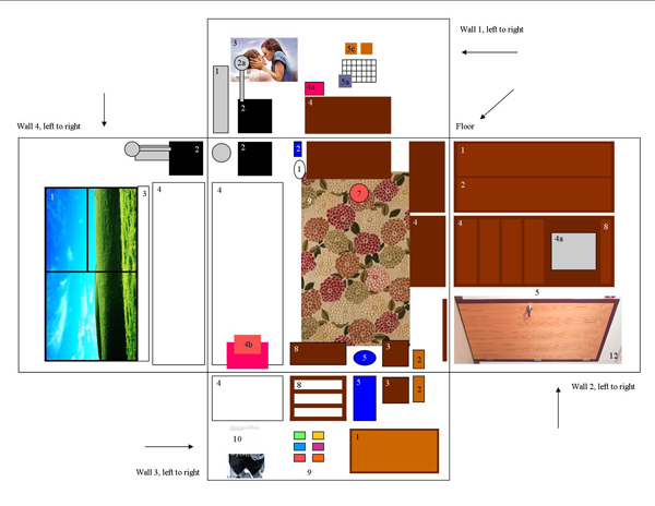
Figure 13: Student Map. Wheaton College (MA)

Figure 14: Student Map. Wheaton College (MA) [42]
Figures 12, 13 and 14 are student maps of the floor plan of their college dormitory rooms that generally include the four walls laid out as a cruciform. The database in which each of these plans are displayed also contains an inventory of the possessions displayed in the map, photographs of three "favorite things," and accounts of how each of these possessions were obtained and why they are prized. Preliminary examination of this database reveals that:
Students arrive easily at a satisfactory shared aesthetic with their roommate, if they have one.
Most students construct a defined area of photographs and other memorabilia on either a bureau or wall located near their bed that serves as a public shrine venerating their more prized relationships and experiences. These special areas are well-maintained even if the rest of the room is strewn with laundry or worse. Nevertheless, the shrines evolve over time from celebrations of hometown associations to new connections established in college and by travel.
Men and women vary in predictable ways. Females prize those possessions that are associated with important relationships in their lives, while men display their technological "toys" conspicuously.
Generally speaking, the most important functional furnishings of the rooms are their beds—where students report being in closest touch with their emotional lives—and, increasingly, their laptops, which connect them to the world. [43]
These three diagrams not only reveal the symbolic density and richness of how students organize their private spaces but also how much they invest in the construction of these diagrams. I suspect that older people would find such an exercise as enjoyable and that otherwise excellent studies of people's relationship to personal objects and private spaces—like David HALLE's Inside Culture (1993), Pierre BOURDIEU's Distinction (1984), and Mihaly CSIKSZENTMIHALYI and Eugene ROCHBERG-HALTON's The Meaning of Things (1987)—would have been improved and enriched by a more imaginative use of visual data.
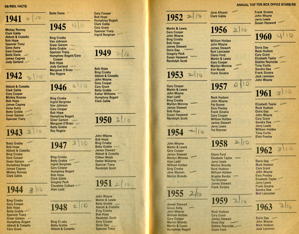
Figure 15: Several Years of the Quigley Poll (STEINBERG, 1978, p.58) [44]
The next two pictures are based on a GIS display of tabular data. The Quigley Poll of the Top Moneymaking Hollywood Stars has been conducted since 1932 and lists in rank order the top ten most popular stars as chosen by distributors (Figure 15). There are good reasons to believe that this is an extremely reliable indicator of the public's favorite movie stars, who are, arguably, the most influential lifestyle exemplars in the public sphere (FOWLES, 1992, p.155). But how should rank and position in this virtual Olympus be determined and displayed?
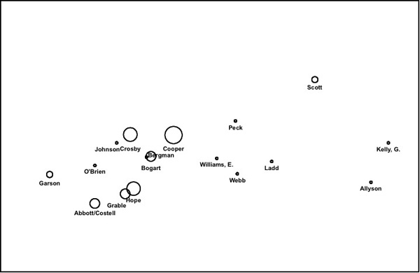
Figure 16: Early Postwar Clustering of Hollywood Top Money-making Stars from Quigley Poll (Chart by John GRADY & Bill HUBER)
[45]
The chart on which Figures 16 and 17 are based reconfigures the tabular data in the Quigley Poll with algorithms derived from geometric graph theory to reconstitute it as a Euclidian Minimum Spanning Tree. The graph measures the strength of association between stars and clusters of stars on the poll, beginning in the 1930s on the left side of the chart through the present on the right. Figure 16 covers the period just after World War II. The size and clustering of the circles suggest that the most salient symbolic models of masculinity during this period are represented by Bing Crosby, Gary Cooper, and Humphrey Bogart, and occupy an important place in the collective fantasy life of the nation, which raise many questions for social scientists. What, for example, do their screen personas have in common? And on what moral and social-psychological issues do they conflict or complement each other? How can their relationships to women be characterized; and so on? Figure 17 represents the entire database and reveals at least five other major clusters, each dominated by an alpha male star. With charts like these, visual research integrates quantitative and qualitative reasoning and introduces rigor and discipline into the study of mass popular culture. In this case, it is a way to prioritize which celebrities we should study first, choosing those who were most popular at the time—and hence probably most influential—rather than those who we happen to find interesting today, as happens so often in critical film theory.
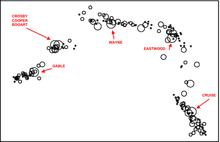
Figure 17: The Top Money-Making Stars in Hollywood from the Quigley Poll (Chart by John GRADY & Bill HUBER) [46]
4.2 Integrating levels of social organization
Social science research is conducted at various levels of analysis. These include the micro-level of society—often involving face-to-face interaction between small numbers of people—and the macro-level, which may encompass the entire population of a nation state or beyond. There are important, and continuing, debates about which level is strategically significant in constructing and maintaining social order. Nevertheless, there is some agreement that the social sciences need to develop theories of the middle range, which would produce models to account for how patterns at one level yield outcomes at another. It is true that the challenge to create viable theories that integrate the bird's eye and the worm's eye views of society is primarily theoretical. Nevertheless, visual data encourage the construction of narratives that segue easily from one level to another.

Figure 18: New Orleans under Water, September 2nd, 2005 (Courtesy DigitalGlobe)
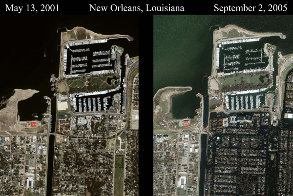
Figure 19: Lakeview District in New Orleans Before and After Hurricane Katrina (Courtesy DigitalGlobe)
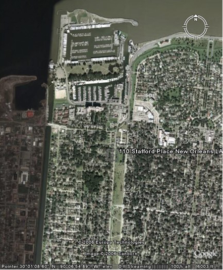
Figure 20: 110 Stafford Place, Lakeview. Medium Altitude (Google Earth)
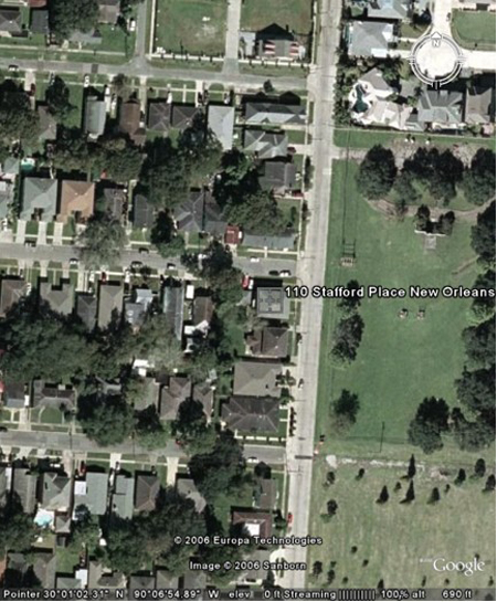
Figure 21: 110 Stafford Place, Lakeview. Low Altitude (Google Earth)
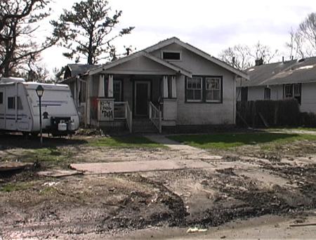
Figure 22: 110 Stafford Place. Lakeview, Front Yard (Photograph by John GRADY, January 2006)

Figure 23: 110 Stafford Place. Front Porch (Photograph by John GRADY, January 2006)

Figure 24: Master Bedroom and Bathroom. 110 Stafford Place (Photograph by John GRADY, January 2006)
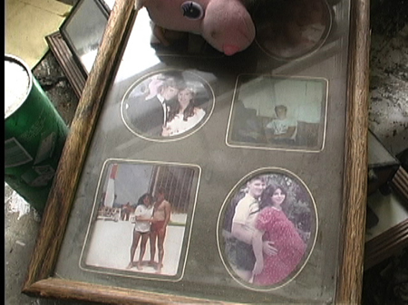
Figure 25: Stack of Family Photographs. 110 Stafford Place (Photograph by John GRADY, January 2006)
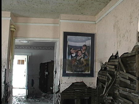
Figure 26: Front Entrance to 110 Stafford Place (Photograph by John GRADY, January 2006)
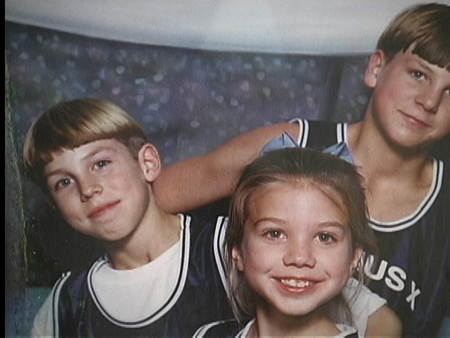
Figure 27: Close-up of Photograph in Front Entrance of 110 Stafford Place (Photograph by John GRADY, January 2006) [47]
A transition between levels of social organization is exemplified by a sequence of photographs of Post-Katrina New Orleans, beginning with an aerial photograph of the city (Figure 18) that zooms to the Lakeview district adjacent to the 17th Street Canal breech (Figure 19). Next are photographs from Google Earth that identify 110 Stafford Street in the northern part of that neighborhood (Figures 20 and 21), which are followed by two ground-level exterior shots of the house that I took in mid January 2006 (Figures 22 and 23). They not only show the damage sustained by the home, but also document an event with important socio-psychological consequences for the family that lived there. The one person who remained at home—an 18 year old boy—was unable to get his dog into the attic in the few minutes between the levee breach and the inundation of the first floor. [48]
There was still debris in the home (Figure 24) but items of sentimental value, like the family photographs in Figure 25, were neatly stacked around the house. One of the most striking images is a large framed photograph of the children that the flood had not dislodged from its place of honor at the front entrance (Figure 26). The picture had been stained, however, by the flood's high-water mark. Whether it serves as a found metaphor for this family's recovery from the disaster remains to be seen (Figure 27). [49]
4.3 The organization of social processes
The study of social process is a third area of social scientific concern where visual researchers make important contributions. At the macro level, social processes are seen as mechanisms with outcomes with large aggregate impacts, like the effect of unemployment on family organization. At the micro level, there are myriad social processes, which include those that involve only the actions of one person, like how a drag queen puts on makeup (Figure 28), to those, which involve fairly substantial groups doing things together in a coordinated way, sometimes over long periods of time, like schooling (Figure 29).
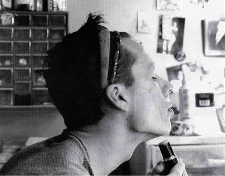
Figure 28: Jeremy Becoming Asia (BROWN, 2001, p.43)
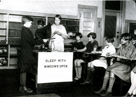
Figure 29: School Culture (MARGOLIS, 2007, p.2) [50]
Most sociologists acknowledge that their field has not been particularly successful studying social mechanisms. Nevertheless, sociology and other disciplines have provided remarkably insightful analyses of many social processes. Visual data is particularly useful in this regard because many processes involve the synchronization of complex and rapid interactions by numerous actors. Photography and video are invaluable for two quite different reasons. On the one hand, photographs are useful for eliciting information from participants about what is going on during the process, which a naïve observer might have missed. Videotape, on the other hand, is invaluable for studying processes that are only glossed in participants' descriptions and reveal interactions that are more complex and challenging than participants' accounts may allow. [51]
The art historian E. H. GOMBRICH, tells us that while "… the visual image is supreme in its capacity for arousal ... its use for expressive purposes is problematic, and … unaided it altogether lacks the possibility of matching the statement functions of language" (1996, p.42). [52]
The capacity of a picture to arouse an emotional response in a viewer provides various sites for studying affect in social life. These include photographs of important persons and events in a person's life as well as less personal images that trigger associations of one kind or another. The pictures may be made by subjects, acquaintances, researchers, or produced by the larger culture. Researchers are interested in the emotions that pictures evoke in subjects and what can be observed in, reported about, or inferred from, their responses. [53]
Most commonly, the former category includes:
controlled photo-observation;
photo-elicitation;
various projective techniques; and
imagery generated by subjects themselves. [54]
The latter category encompasses varied mass communications media—most notably advertising, television and the movies—that immerse contemporary society in a flood of emotionally evocative visual stories and tableaux. The content of these narratives exploit an audience's fears, desires and preoccupations in ways that are broadly acceptable. As such, these narratives constitute extremely time-sensitive indicators of social psychological change in large collectivities. Nevertheless, establishing what can, and cannot, be inferred reliably poses a daunting challenge to researchers who use these materials. The dearth of databases containing comprehensive and representative samples of popular culture is a serious obstacle to the kind of attentive debate that would encourage improving methodology and interpretation.
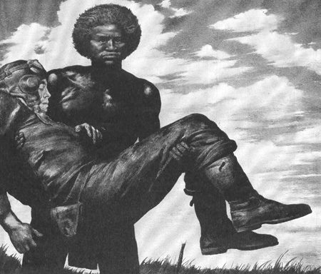
Figure 30: Advertisement for Curtis Wright Aircraft (LIFE Magazine, October 16, 1944) [55]
The image in Figure 30 is in an advertisement for the Curtis Wright Aircraft Corporation that appeared in Life Magazine in October 1944 to garner support for the aircraft industry. It reminds readers of the debt they owe to those who fly planes in their defense, are shot down, and return to fly again. That the white airman is returned to safety "carried in the arms of a primitive brown man" is the only reference to the other figure in the picture. The picture, of course, is part of a long history of exoticizing Blacks as primitive foils for Western values and norms. Whether depicted as barbaric or noble savages, erotic or sexually repulsive, the images in this iconography clearly demarcate between the moral world of the viewer and that of the non-Western other.
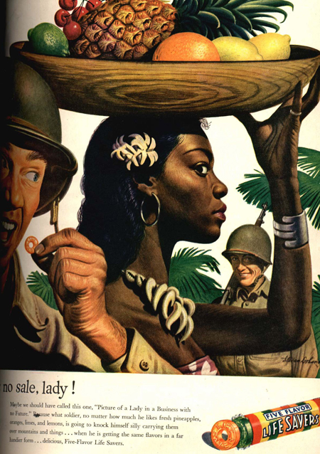
Figure 31: Advertisement for Lifesavers (LIFE Magazine, May 29, 1944) [56]
This particular representation of a white man in distress, who is designated as our savior in the text of the advertisement and enfolded in the Pieta like embrace of a black man, is one of three images of white soldiers being cared for by tribesmen found in LIFE Magazine in late 1944. There are also three other advertisements that depict white servicemen exhibiting interest in sexual contact with a "native" woman, which are also set in the tropics (Figure 31). In addition, several other images show white soldiers in various stages of undress while in the presence of very dark-skinned "natives" (Figure 32 and 33). In all, these pictures cover the period from January to November 1944 and constitute a striking departure from more conventional depictions representing whites with "primitive others."
First, they violate prevailing contemporary norms, if not taboos, about physical contact between blacks and whites;
second, they depict whites either needing, or seeking, protection, sex, or comfort from blacks;
finally, while blacks during this period are often shown helping whites, in these images they tend to be cast more as "subordinate allies" rather than as "attentive servants," which differs from how they were depicted on the home front both before, during and after the war until about 1960.
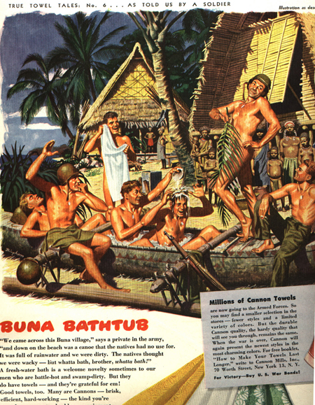
Figure 32: Advertisement for Cannon Towels (LIFE Magazine, June 26, 1944)
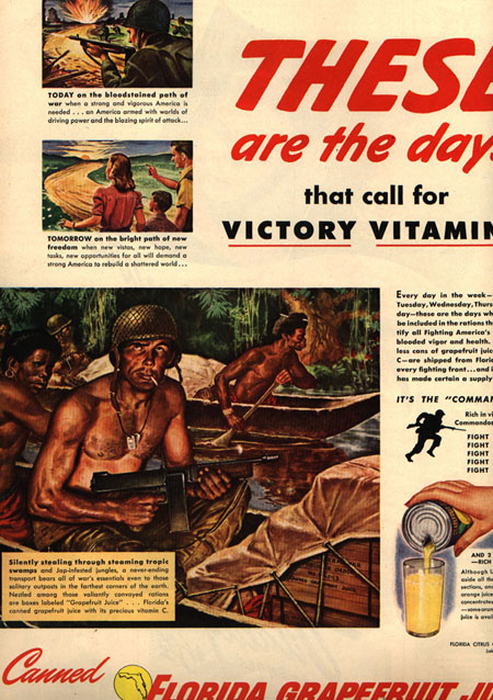
Figure 33: Advertisement for Florida Citrus Council (LIFE Magazine, September 11, 1944) [57]
There is no explanation based on ideological or interest group factors that can credibly account for why this blurring of racial norms took place at this time and then so quickly disappeared. It is possible, however, to imagine a naturalistic scenario that accounts for how these images might have addressed, and relieved, emotional needs, which sophisticated advertising agencies, in their perpetual quest to discover the cutting edge of popular concern, would have decided was worth the risk. [58]
These small tableaux, of course, were produced for home consumption by a population composed disproportionately of women, many of whom must have been wives, sweethearts and kin of servicemen in the Pacific. How might women at home have viewed images of their men cavorting naked in front of, lasciviously eying, and, at their most vulnerable, physically dependent upon, blacks; and what do these narrative themes reveal about American emotions in 1944? [59]
First, the pictures of men in various stages of undress probably functioned as "beefcake" pictures of attractive male bodies, a somewhat more restrained version of the "pin-ups" that men were displaying wherever they could. The presence of "natives" in these images are props that legitimate undress as a natural human response to tropical heat, In the previous slide, an audience composed of an entire village establishes that the white men are engaged only in innocent horseplay.
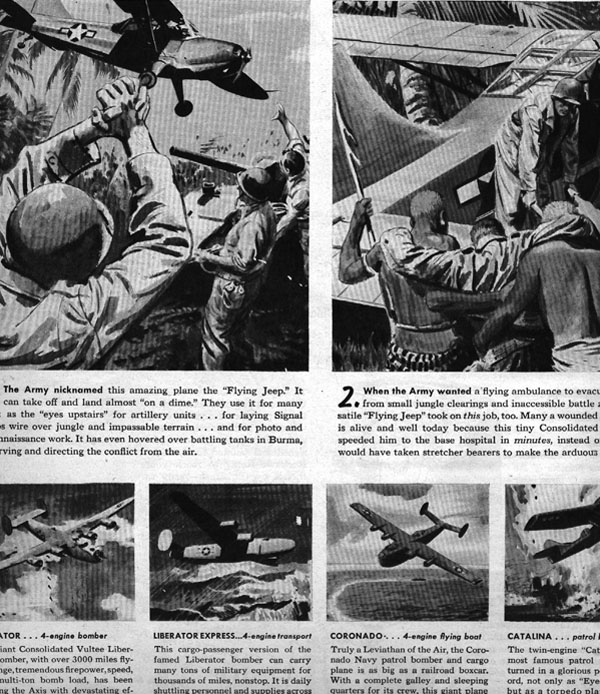
Figure 34: Advertisement for Consolidated Vultee Aircraft Corporation (LIFE Magazine, November 6, 1944) [60]
Second, no wounds are represented graphically on any of the injured soldiers and in two of the images—including this one—they are being carried to a waiting plane (Figure 34), which suggests that there is an efficient system of medical attention reaching into the most inaccessible of terrains, while the tribesmen constitute a most extraordinary, and effective, ambulance service. [61]
Third, all of the representations of white men and native women that hint at, or are explicit about, sexual contact are accompanied by various cautionary messages, which suggest that such contact is not a good idea and, which in Figure 35 might be dangerous for several reasons.
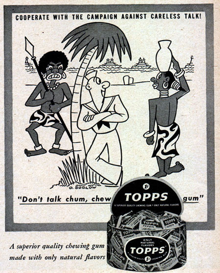
Figure 35: Advertisement for Topps Gum (LIFE Magazine, March 13, 1944) [62]
In other words, this extraordinary blurring of traditional norms regulating how white nudity and physical contact between whites and blacks should be displayed appears to be highly situational and supports a narrative that reassured women at home about the well-being of their men under arms. Finally and undoubtedly, their concerns were exacerbated by a dramatic increase in bloody island combat that began with the battle of Tarawa in November 1943. Wide-spread protest over what seemed like a terrible waste of life for worthless real estate was only relieved one year later after the Battle of Leyte Gulf rendered the Japanese navy inoperative and signaled that an end to the war in the Pacific was inevitable. This period of heightened concern over the consequences of a risky military strategy correlates quite closely with the change in imagery. [63]
My interpretation of these images is certainly plausible. Nevertheless, a more thorough reading might alter the interpretation in important ways. But for such a reading to take place, others would have to have access to these images and to the database in which they are lodged. Such access is rare in the world of visual research. [64]
4.5 Displaying and communicating research findings
Communicating research findings is the fifth and final area of concern to which visual data can contribute. Pictures can confuse as much as illustrate, and distract as much as engage, because they are cluttered with information and encourage us to share the arousal of the picture maker. Accounting for some bits of information in a picture, while discounting others, makes writing with, and about, visual data a difficult affair.
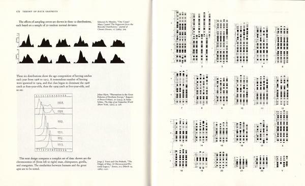
Figure 36: Edward TUFTE (1983, pp.172-173) [65]
Some writers have solved the problem by having the pictures drive the narrative. Edward TUFTE (1983), for example, has pictures on virtually every page, makes them as large as they need to be, and discusses them on the same two-page layout on which they appear (Figure 36). The pictures are not merely referenced but also described and analyzed in some detail. Figure 36 is part of a section discussing "small multiples." TUFTE advocates the use of small multiples as a design strategy because "the design remains constant through all the frames, so that attention is devoted entirely to shifts in the data" (1983, p.170). The facing pages in Figure 36 not only have three displays, but the entire text discussing these examples of small multiples are present to a reader with the book open in front of them (ibid., pp.172-173). [66]
Picture-driven narratives, like TUFTE's, encourage suppler arguments that better account for variation in the phenomena and make for more engaging reading. The same case can be made that documentary film and other new media are tools, which could strengthen a social scientific communication that is too often moribund. [67]
Visual research has much to offer the social sciences. To fulfill its promise, however, it should be subjected to scrutiny and evaluation. There are three principal issues about visual research as an intellectual project that require systematic attention. [68]
5.1 Evaluating the theoretical and conceptual basis of visual research
How well do our theories work in making sense of what we set out to study? What kinds of issues should we be addressing, but haven't been? How clear and useful are our conceptual vocabularies? Can we ground them easily or do they flit like quicksilver whenever we try to apply them to experience? What are the conceptual strengths and weaknesses of the various schools of thought, which make claims on our attention? [69]
One way to begin evaluating the adequacy of our theoretical and conceptual armory, therefore, might be to subject the most influential schools of thought, and/or thinkers, to a sustained critical scrutiny by scholars from a wide range of disciplines, both sympathetic and unsympathetic. James ELKINS in Visual Studies: a Skeptical Introduction lists some thirty or so people who figure in the "canon" of visual culture and estimates that he could add several pages more: "But it would not turn up anyone as fundamental and as often cited as Barthes, Benjamin, Foucault, Lacan and two or three others. They are effectively, the theoretical bases of visual culture" (2003, p.33). [70]
Would any one of them be in our canon? Might evaluating them be a place to begin? And if not them, then who should we look at? Should we start with citation frequencies? The point of such an exercise is to relieve the lonely scholar of the burden of coming to terms with ELKINS' pages of authorities, and place it where it belongs, on a more collective peer review process. The benefits of such an exercise for graduate training cannot be over-estimated. [71]
5.2 Creating public databases to develop and test theory
Do we have enough data on the topics that we study to test the strength of those theories that we find most promising, or is it not an accident that our studies tend to be "under-researched"—to use Gillian ROSE's marvelously diplomatic characterization (2001, p.2)—because we lack comprehensive databases? What questions could justify constructing large databases by teams of scholars? Could such data be collected in conjunction with other research investigations in the social sciences? Should such databases be constructed primarily with a general research question in mind or as a way of exploring the limits and possibilities of visual data? Could eager teams of students and others be mobilized to collect partial data sets under stipulated conditions? Where would these databases be stored and how would they be accessed? Should we make inventories of what we have studied as a way of identifying those issues and questions that need to be addressed? [72]
5.3 Defining "best practices" for visual research
How good are our methods? What issues and aspects of human experience can they address successfully? How should they be supplemented by other methods? How important is the design of unconventional yet reliable methods in broadening the scope of our research competencies? What questions require more than one methodology? Perhaps most importantly, can we design "best practices" or protocols for achieving common research goals? Should we? [73]
Visual research has made great strides in the social sciences during the last quarter of a century. There are now so many practitioners of the art that it is increasingly difficult just to keep abreast of work in our own disciplines, not to mention on-going research in other fields that may be addressing issues of common concern. Multi-disciplinary conferences, like the EUROQUAL Conference on Qualitative Visual Data Analysis held in Berlin in September 2007, have an important and necessary role to play creating those forms of organization and communication to consolidate our gains and codify our work. The leadership shown by EUROQUAL is a harbinger that we are now embarking on that journey. [74]
Bourdieu, Pierre (1984). Distinction: A social critique of the judgment of taste. Cambridge, MA: Harvard University Press.
Brown, J. Brian (2001). Doing drag. Visual Sociology, 16(1), 37-54.
Calcott, Steve (2006). Mexico city traffic, http://www.flickr.com/photos/stevec77/87374852/ [accessed October 2, 2008].
Csikszentmihalyi, Mihaly & Rochberg-Halton, Eugene (1987). The meaning of things: Domestic symbols and the self. New York: Cambridge University Press.
Dyer, Geogg (2005). The ongoing moment. New York: vintage books.
Elkins, James (2003). Visual studies: A skeptical Introduction. New York: Routledge.
Fowles, Jib (1991). Startstruck: Celebrity performers and the American public. Washington, DC: Smithsonian Institution Press.
Gombrich, Ernst H. (1996). The visual image: Its place in communication. In Richard Woodfield (Ed.), The essential Gombrich (pp.41-64). London: Phaidon Press.
Halle, David (1993). Inside culture: Art and class in the American home. Chicago: University of Chicago Press.
Kunhardt, Dorothy Meserve & Kunhardt, Philip B. (1993). Twenty days. New York: Castle Books.
Maines, Rachel (1999). The technology of orgasm. Baltimore: Johns Hopkins Press.
Margolis, Eric (2007). Guest editor's introduction. Visual Studies, 22(1), 2-12.
Rose, Gillian (2001). Visual methodologies. Thousand Oaks, CA: Sage.
Steibling, Megan (1999). Practicing gender in sports. Visual Sociology, 14, 125-142.
Steinberg, Cobbett (1978). Reel facts. New York: Random House.
Tufte, Edward (1983). The visual display of quantitative information. Cheshire, CN: Graphics Press.
Wallace, Anthony F.C. (1961). Culture and personality. New York: Random House.
John GRADY's research focuses on the impact and significance that the material world of nature and human artifacts has on social organization and daily life; the use of visual imagery in social research and analysis; and making documentary films. He was President of the International Visual Sociology Association (IVSA). He is currently a Visiting Scholar at the Salt Institute for Documentary Studies in Portland, Maine (http://www.salt.edu/), and is the New Media Editor for Visual Studies
Contact:
John Grady
Professor of Sociology
Wheaton College
26 East Main Street
Wheaton College
Norton, MA 02766-2322
Office: Knapton 304, USA
Phone: 508-286-3655
E-mail: JGrady@wheatonma.edu
URL: http://wheatoncollege.edu/Faculty/JohnGrady.html
Grady, John (2008). Visual Research at the Crossroads [74 paragraphs]. Forum Qualitative Sozialforschung / Forum: Qualitative Social Research, 9(3), Art. 38, http://nbn-resolving.de/urn:nbn:de:0114-fqs0803384.

Creative Commons Attribution 4.0 International License