Volume 11, No. 2, Art. 37 – May 2010
Mapping Urban Social Divisions
Susan Ball & Petros Petsimeris
Abstract: Against the background of increased levels of interest in space and images beyond the field of geography, this article (re-) introduces earlier work on the semiotics of maps undertaken by geographers in the 1960s. The data limitations, purpose and cultural context in which a user interprets a map's codes and conventions are highlighted in this work, which remains relevant to the interpretation of maps—new and old—forty years later. By means of drawing on geography's contribution to the semiotics of maps, the article goes on to examine the concept of urban social divisions as represented in map images. Using a small number of map images, including two of the most widely known maps of urban social division in Europe and North America, the roles of context, data and purpose in the production and interpretation of maps are discussed. By presenting the examples chronologically the article shows that although advances in data collection and manipulation have allowed researchers to combine different social variables in maps of social division, and to interact with map images, work by geographers on the semiotics of maps is no less relevant today than when it was first proposed forty years ago.
Key words: census data; Chicago School; ethnic group; maps; semiotics; social class; urban social divisions
Table of Contents
1. Introduction
2. Maps and Geography
3. Semiotics, Semantics and Syntax in the Study of Maps
4. The First Modern Map of Social Division
5. The Chicago School and the Mapping of Ethnic Social Division
6. Combining Ethnic and Social Class Division Using the British Census of Population
7. Conclusions
Just one illustration of the current topicality of maps, beyond the confines of geography departments, is the debate which has opened up on the internet over the "new map, new danger" position. Those who adopt this position are usually characterized as traditional geographers (or "palaeogeographers"). They are concerned that by democratizing data and the means of their analysis, the internet will allow non-experts to make maps, "virtual maps" and models. On the other side of the debate, a wide range of users point to how the new technologies will lead to a user-centered "neogeography" which may connect and empower people.1) [1]
Neologisms such as "palaeogeographers," "neogeography" and "virtual maps," if they serve any purpose at all, help point to the topicality of maps within, between and beyond disciplines, and between the overlapping categories of map constructors, producers and end-users. However, just at the time that many other disciplines have turned to the use and interpretation of maps, i.e. the semiotics of maps, geography in the English-speaking world has seemingly lost interest in this form of image; as is evidenced by cartography having been dropped from the core syllabus of many undergraduate degrees in geography. This is unfortunate for a number of reasons2), amongst which is the risk that earlier work on the semiotics of maps undertaken by geographers in the 1960s will not be given due attention. In this paper we will briefly consider the position of maps in the field of geography and the contribution of geographers to the study of the semiotics of maps. On the basis of the advice offered by geographers in the 1960s for the study of maps, we will go on to examine the concept of social division as represented in map images. We hope to show that some of the basic rules of semiotics unite geographers ("neo," "palaeo" or otherwise) with the makers, producers and users of maps in other disciplines and beyond. [2]
Maps are familiar objects to many people. On a day-to-day basis we may consult a wide variety of maps including: street maps, tourist maps, subway, underground, metro maps, weather maps, virtual maps ranging from those drawn in the air to various kinds of online virtual globes, mental maps and historic maps. Although we use maps, and by experience may have come to trust them to varying degrees, there is also a general tendency to treat maps as a specialist concern. Notwithstanding their use by a wide range of disciplines, maps are often regarded as needing the skilled treatment of geographers. For many years maps were a defining feature of this discipline, and at times aroused quite strong emotions among geographers:
"Show me a geographer who does not need them constantly and want them about him, and I shall have my doubts as to whether he has made the right choice of life…. Maps break down our inhibitions, stimulate our glands, stir our imagination, loosen our tongues. The map speaks across the barriers of languages; it is sometimes claimed as the language of geography" (SAUER, 1963, p.391, quoted in HARVEY, 1969, p.369). [3]
For the twenty years following SAUER's claims for the positive capacities of maps, their role in defining geography as a discipline remained important. Over this period, geographers' and cartographers' definitions of what constitutes a map broadened, leading to the often-quoted definition provided by the University of Wisconsin-based History of Cartography Project: "Maps are graphic representations that facilitate a spatial understanding of things, concepts, conditions, processes, or events in the human world" (HARLEY & WOODWARD, 1987, p.xvi). [4]
This definition led to some consternation among those geographers and cartographers who took a more scientific and deterministic view of maps, and who held that the quality of a map should be assessed primarily in terms of its geometrical accuracy. Their work had been influenced by the emergence of computer usage and the aid it gave to the development of statistical and mathematical models over the same twenty-year period. However, as computer cartography and Geographical Information Systems (GIS) advanced during the 1970s and 1980s, it became clear that they had their limits. "Scientific cartography" was not able to match the complex decision-making rules that geographers use when creating maps. While the marriage of GIS and expert systems since the late 1980s has attempted to bring behavioral and artistic skills back into cartography, there is a general perception that GIS has replaced the broader field of cartography in the teaching of geography in English-speaking universities. [5]
This is not to suggest that maps have been lost to geography in the English-speaking world; they are still the geographer's preferred "graphic image" and "the association between geographer and map remains strong in the popular mind" (COSGROVE, 2008, p.3). However, maps and the study of space have also been taken up by other disciplines (WARF & ARIAS, 2008). This is in part due to the advances that have been made in GIS, allowing spatially referenced digital data to be easily created and manipulated. It is also due to a more general appreciation of the visual by academics3) and non-academics alike. [6]
This recent interdisciplinary interest in maps has more to do with the practice of mapping, than their form or design; as CRAMPTON (2009, p.840) has observed: "We seem to be moving from a niche-based study of maps as objects to a more comprehensive (and potentially interdisciplinary) study of mapping as practice, the knowledge it deploys, and the political field of its operations." [7]
Cartographers like Brian HARLEY (1989 and 1990), who pointed to the role that many cartographic practices performed in colonial domination and exploitation, have also considerably assisted in the development of a wider appreciation of the dual function of maps. Viewed as both a social product capable of providing insights into the mind of its maker (as cartographer, scientist, artist, colonialist, explorer, helper on the street, etc.), and as an active agent in the process of communication, maps and mapping have been opened up to a range of interpretative approaches in and across a variety of disciplines4). Much of this work draws on the idea of semiotics to relate language to the sign systems of maps. This is not, however, a new departure. In the 1960s, a number of geographers, most notably BERTIN (1967) and HARVEY (1969) were drawing attention to a semiotic or semantic approach to the study of maps. [8]
3. Semiotics, Semantics and Syntax in the Study of Maps
David HARVEY starts his consideration of the representation of spatial data in the form of maps by pointing to the considerable literature on the technical problems of map-making as opposed to "the almost total lack of consideration for the logical properties of the map as a form of communication" (HARVEY, 1969, p.370). In the same year that HARVEY noted this imbalance between the technical and human properties of maps, UNESCO helped rebalance the scales by adopting a Peters Projection World Map in one of its campaigns. Arno PETERS' map of the world shows the true size of continents relative to one another in contrast with the MERCATOR projection, in which the developed world appears in exaggerated size relative to the developing world.5) While many of the people viewing this map in the UNESCO campaign may not have given much consideration to the technical problems of map-projection that MERCATOR's and PETERS' maps disclosed, the human-element of map-making and map-reading was probably not lost on most of them. [9]
HARVEY addresses the map as a form of communication between map-maker and map-reader by considering it as a "text linking map structure with real-world structure" (HARVEY, 1969, p.372). Drawing on the unpublished work of DACEY,6) HARVEY states that this text should be analyzed in terms of its semantics, syntax and pragmatics:
A study of the semantics of a map would point to the relation between geographic concepts and their symbolic representation on a map. While map symbols, i.e. what is shown on a map, often appear to be precise; the geographic concepts on which they are based may be ambiguous. Hence by studying the semantics of maps attention will be drawn to the definition of concepts. However, HARVEY also notes that the "factual statement which a map makes is two stages removed from the reality being described" (HARVEY, 1969, p.373); and while formal semantics may help us with the first stage, the relation between geographical concepts and their reality requires empirical validation.
HARVEY uses syntax to refer to "the internal structure of map statements and its basic form as an abstract calculus" (HARVEY, 1969, p.374). The short paragraph HARVEY devotes to syntax refers to the "peculiarities" or "special features" of map languages, and gives the example of the absence of negative statements.
It is with reference to pragmatics that HARVEY makes specific reference to the relation between the map symbol and the map-maker/-user. He draws attention to the fact that all maps were made with a specific purpose, and that although one has to be careful when using them for different ends such use may be useful in terms of hypothesis building. Furthermore, while symbols may be used by the map-maker to elicit a particular response from the map-user, they are open to interpretation depending on the cultural background of the map-user. Lastly, he warns the user that although maps may appear to give a firm visual statement, they are only as good as the data on which they are based (HARVEY, 1969, pp.374-376). [10]
The main points made by HARVEY over forty years ago on the interpretation of maps were also made by a number of his contemporaries. The work of the French geographer BERTIN (1967), for example, highlighted the importance of conventions and codes in map making and interpretation. Just as the ability of maps to place millions of bits of information on a single page or screen has been enhanced over the forty year period since these geographers outlined a language or semiotic approach to the study of maps, so has the need to bear in mind their advice:
maps are only as good as the data on which they are based;
each map was made with a specific purpose in mind; and
the interpretation of map signs may vary across cultures. [11]
This approach to the interpretation of maps of social division will be used in the following sections. [12]
4. The First Modern Map of Social Division
The first modern social survey was undertaken by Charles BOOTH in London in the late 1880s. Although social surveys had been conducted in London from the 1840s by members of the Victorian statistical movement keen to acquire information about the living conditions of the poor, BOOTH's survey of the people of London was notable in two respects. First, it was acclaimed at the time for its method, detail and scope. "Life and Labour of the People of London," published by Macmillan in 1902-03, ran to seventeen volumes. Second, he presented his data in the form of thematic maps that related the conditions of different social classes to each other rather than presenting a thematic map of one social class (most usually the poor) in isolation. [13]
BOOTH undertook his survey of the London poor with the aim of obtaining a clearer understanding of their culture and living conditions than that provided in the stereotypical view provided by investigative journalists when reporting on the inhabitants of the "other world" or "the abyss." In line with Fabian-thinking7), he believed that detailed social survey should form the basis for a more informed discussion of the problem. While much has been made of his aim to counter the claim made in an article published in the Pall Mall Gazette in 1886 that 25% of London's population was living in poverty and posed a threat to the rest of society, this was probably no more than a spur to his overall aim of informing the discussion of the wider problem of poverty in London. [14]
At the outset of BOOTH's survey, the most extensive information available on the conditions of the London poor took the form of the reports of School Board visitors who were required to collect personal information about families with children aged between 3 and 13. The officers were familiar with the districts they visited, however, their method of appraising a family and the street in which it lived would inevitably involve subjective elements. In recognition of this, BOOTH recruited a team of volunteer researchers, who would check and revise the data provided by the School Board reports. In addition to the extensive field visits, interviews with clergy, lay helpers, local police and employers, a special survey of school teachers, and Poor Law and census returns were all used in making judgments on the allocation of individual streets to one or other of category of relative wealth. [15]
BOOTH divided the data between eight sub-groups, the first four of which made distinctions between different degrees of poverty. Class A covered the lowest class of the so-called "occasional loafers and semi-criminals." As they accounted for no more than 1.25% of the population, BOOTH concluded that "[t]he hordes of barbarians of whom we have heard who, coming forth from their slums, will some day overwhelm modern civilization, do not exist" (BOOTH, 1888, p.305). Class B referred to the very poor, who were casual laborers, leading a hand-to-mouth existence and suffering from chronic want. Classes C and D included those whose earnings were small, either because their work was irregular or ill-paid. Immediately above classes A-D which constituted the poor and 30% of the population of London, were classes E and F which were also working class but better paid and in regular employment. Classes G and H comprised the lower- and upper-middle class and all above. By combining a variety of sources of mainly subjective information BOOTH was able to establish categories that were sufficiently distinct in lifestyle to constitute social classes. His next task was to transfer this data to a map (see Illustration 1).
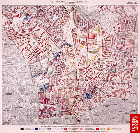
Illustration 1: A sheet from BOOTH's poverty map of London, 18918) [16]
BOOTH attributed a color to each or combinations of his social classes, which was then applied on a street-by-street basis9). By combining elements of different social classes in the same color category, BOOTH acknowledged the juxtaposition of different social classes on the same street. His detailed notes describing the color code make clear that he was aware that the code was less than perfect in terms of taking into account the vast variety of circumstances that the social mix of households on any one London street may cover (BOOTH, 1889). Although he added a degree of elasticity to his 7-grade color code by means of devising a "mixed" category and allowing for combinations of colors on the same street, he was aware that some of the difference in lifestyle could not be represented by a color code. Furthermore, the visual impact of BOOTH's maps was aided by abrupt changes in colors, rather than a fine gradation permitting more classes to be introduced. By choosing black to represent streets with households in the lowest class in contrast to yellow to represent the most wealthy class, we can assume that BOOTH intended his maps to make a firm visual statement. [17]
BOOTH provided not merely descriptive but social maps of London. His detailed survey work and the form of the classification he used meant that for the first time the social order of London could be represented on a cartographic plan of the capital. His a priori model of poverty and wealth in London was an essential element in the development of theories of the social geography of the capital. [18]
5. The Chicago School and the Mapping of Ethnic Social Division
The work of BOOTH influenced the development of the social survey method, but was most directly employed—and with greatest effect on the social sciences—by W.E.B DU BOIS in his work on the black population of Philadelphia. DU BOIS used BOOTH's methods to classify black families into social classes, ranging from the "very poor and semi-criminal" to the "well-to-do" (DU BOIS, 1967 [1899]). Although he proposed a theory of intergenerational poverty among the very poor of the ghetto, it was members of the Chicago School in the 1930s who would build on DU BOIS' work in order to theorize the "zone of transition" and what was to become a familiar pattern of social segregation (for a discussion of the Chicago School of sociology see BULMER, 1984). [19]
The Chicago School's work on segregation was to find spatial representation most famously in the map prepared by Ernest BURGESS (Illustration 2), but also in the map prepared by the French sociologist Maurice HALBWACHS following his return from Chicago in 1932 (Illustration 3). These two maps have been chosen because they illustrate the points made by HARVEY and BERTIN concerning the semiotics of maps (data, purpose and interpretation). Moreover, as the historian Denis SMITH has noted in reference to BURGESS' map: "There is no more famous diagram in social science than that combination of half-moon and dartboard depicting the five concentric urban zones which appear during the rapid expansion of a modern American city such as Chicago" (SMITH, 1988, p.28).
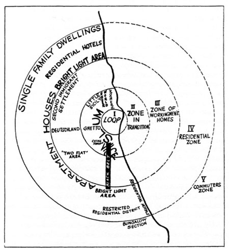
Illustration 2: BURGESS' chart II of urban areas of Chicago, 1920s10) [20]
BURGESS' map, or "chart" as the author calls it, is an attempt to capture the dynamics of the expansion of a metropolitan city (Chicago) in a general model applicable to every city, or at least to every American city, with minor variations due to historic processes and topographic distortions (or as BURGESS calls them: "complications").
"The typical process of the expansion of the city can best be illustrated, perhaps, by a series of concentric circles, which may be numbered to designate both the successive ones of urban extension and the types of the areas differentiated in the process of expansion" (BURGESS, 1984 [1925], p.50). [21]
In this map we have Chicago, the archetypal city, that represents also the model of the world city or of the cosmopolitan American city, composed of five successive concentric and differentiated rings: the central business district ("the loop"), the "zone in transition," the "zone of workingmen's homes," "the residential zone" and the "commuters zone." In addition to the concentric rings there are a number of other representations referring to the slum, the black belt, Chinatown, the ghetto, Little Sicily, and a number of areas that are the result of a mix of moral topographies and functional characteristics of housing and zoning: slum, vice, underworld roomers, apartment houses, bright light area, residential hotels, single family dwellings and restricted residential areas. By spatially locating and combining ethnic groups, housing typologies and functional divisions of space, BURGESS presents a "chart" which looks like a cross between Ebenezer HOWARD's vision of the polycentric of the virtual city of tomorrow (HOWARD, 1898) and the moral topographies of BOOTH. [22]
On the basis of his map, BURGESS put forward the first theory concerning the social pattern of the Western city. According to BURGESS there is a very close relationship between migration and growth of the city, not only in quantitative terms but also in terms of the transformation of the social and ethnic urban landscape. For this process he uses the metaphor of the tidal wave:
"The significance of this increase consists in the immigration into a metropolitan city like New York and Chicago of tens of thousands of persons annually. Their invasion of the city has the effect of a tidal wave inundating first the immigrant colonies, the ports of the first entry, dislodging thousands of inhabitants who overflow into the next zone, and so on and on until the momentum of the wave has spent its force on the last urban zone" (BURGESS, 1984 [1925], pp.57-58). [23]
For BURGESS the growth of the city is the result of a twofold process of diffusion and concentration that has as results new forms of social and spatial organization, and the production of a new unstable equilibrium between the communities and space, and between the communities themselves. Together with Robert E. PARK, BURGESS went on to elaborate "concentric zone theory" drawing on Darwinian concepts of evolution (competition and succession) to explain the spatial organization of urban areas (see PARK, BURGESS & MACKENZIE, 1984 [1925]). PARK and BURGESS' urban ecology theory has attracted considerable interest, and it is worth emphasizing the importance attached to maps within this theory. BURGESS insisted that his students acquired basic cartography skills, and spent a considerable amount of his and his students' time collecting data that could be used in the preparation of maps of Chicago. Among his contemporaries, BURGESS made the most extensive use of census data in the preparation of maps (BULMER, 1984). [24]
BURGESS' map was and is very important because he was trying to spacialize knowledge of city structures and city dynamics, and incorporate all the theoretical knowledge of his time (land economics, human geography, plant ecology, sociology, town planning and regional surveys) in his model and to generalize it. His representation is a complex one that associates economic, functional and ethnic differentiation in terms of temporality according to the time of arrival of an ethnic group and it's degree of assimilation. This map was also the conceptual basis for the production of HALBWACHS' map.
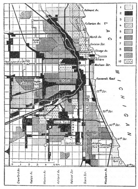
Illustration 3: HALBWACHS' ethnic map of Chicago11) (Key: 1. Parks, boulevards; 2. industry and railways; 3. Germans; 4. Swedes; 5. Czechoslovakians; 6. Poles and Lithuanians;
7. Italians; 8. Jews; 9. Negros; 10. mixed population) [25]
On his return to France, HALBWACHS presented the work of the Chicago School on ethnic division in a map entitled "Carte ethnique de Chicago" (HALBWACHS, 1932, p.27; reproduced in GRAFMEYER & JOSEPH, 1984, p.300). The map was based on the outline provided by F.M.THRASHER in his study of 1920s gangland Chicago (HALBWACHS in GRAFMEYER & JOSEPH, 1984, p.303). HALBWACHS also benefited from the cartographic skills and advice of his colleague Henri BAULING, who was a student of the founder of modern French geography Vidal DE LA BLACHE. The data on ethnic group was taken from the US census of population of 1920. This census contained questions on "color or race," place of birth, mother's place of birth and mother tongue, father's place of birth and mother tongue. HALBWACHS does not make clear which of these categories he drew on in compiling his own "ethnic groups." The labels HALBWACHS gives to each of his ethnic groups refer to ethnic characteristics, such as religion (Jew), and "race" (negro). When he identifies the categories of Germans, Swedes, Czechoslovakian, Poles and Lithuanians, and Italians, he does not make clear if these have been drawn up using data on nationality or language. [26]
In this map, HALBWACHS superimposes the population by ethnic group on a land use map of the city. Although HALBWACHS' map is clearly more scientific in terms of scale than the more familiar map proposed by BURGESS, it provides no information on the absolute numbers, percentages or relative concentrations of the different ethnic groups. As the legend to the map clearly shows, HALBWACHS arrives at a spatial mosaic of Chicago by means of selecting from three layers of information: the city's infrastructural topography, its industrial topography and the ethnic composition of its population. [27]
In the written text accompanying his map, HALBWACHS sets out to explain the complexity of the representation of social groups in space:
"The development of Chicago has been an artificial operation, that was the result of the annexation and incorporation of groups, mainly strangers that have progressively filled the empty spaces of this city. When one writes the names of the races or nationalities on the different neighborhoods, Chicago looks like a mosaic. Let us cancel these names (of ethnic groups) and simply say that here there are many manual workers linked to the big industries, there craftsmen, skilled workers, shopkeepers, clerks, employees, etc. In place of a series of juxtapositioned neighborhoods, we perceive a succession of superimposed social strata" (HALBWACHS 1932, in GRAFMEYER & JOSEPH, 1984, p.324; our translation). [28]
HALBWACHS "cancels" ethnic group and puts in its place a classification of social classes. As a specialist of sociology in early 20th century France, and a colleague of DURKHEIM, the importance he attaches to social class for the interpretation of social phenomenon is hardly surprising. He established a hierarchy of ethnicity as a proxy for a socio-economic hierarchy. At the bottom of the hierarchy were "the negros," followed respectively by Italians (from the South followed by those from the North), Poles, Russian Jews, Irish and Germans. With the exceptions of "the negros" and the Jews, each of these groups was viewed primarily as a socio-economic group distinguishable in terms of their relative salaries. The Jews and "negros," however, were considered as two groups in which ethnicity played a key role in defining their social status. By conceptualizing class and ethnicity in his statistical landscape of Chicago, HALBWACHS drew on his flaneur observations of the city and his theoretical formation in the French school of sociology with its focus on social difference12). [29]
BURGESS' and HALBWACHS' models of the social characteristics of Chicago have since been criticized as overly simplistic and superficial. In line with its greater prominence BURGESS' map has been subjected to the most criticism by, among others, a number of the leading geographers and sociologists of the second half of the twentieth century (BERRY & KASARDA, 1977; DAVIES, 1984; HARVEY, 1973; JONES, 1966; QUINN, 1940, and SAUNDERS, 1981). These critiques point to the deterministic and mechanistic nature of the social patterns outlined by BURGESS, and collectively show the advances in thinking that have been made since the 1920s on the social, cultural, political and economic aspects of urban life. However, as Mike DAVIS' application of BURGESS map in his study of disaster in Los Angeles shows, it is still being applied three-quarters of a century after it first appeared (DAVIS, 1998). Furthermore, an important legacy of BURGESS' work has been the addition of cartography to the methodological and theoretical toolkits of other disciplines beyond geography, most notably sociology. [30]
6. Combining Ethnic and Social Class Division Using the British Census of Population
Social scientists at the Chicago School and Strasbourg in the 1930s were not the first to place ethnic information on a map. The Babylonian map of the world, traced on a clay tablet in the seventh or sixth century before the Common Era (BCE), made distinctions between Aramaean and Kassite territories (Illustration 4).13) However, the long history of cartography of ethnic and social segregation has not provided us with an agreed definition of ethnic and social classes. Even within the context of the last two Censuses of Population of the United Kingdom (1991 and 2001), the question on ethnic group has been subject to revision and remains controversial.

Illustration 4: Babylonian map of the world, British Museum, London14) [31]
Compared to the population censuses of the majority of European countries, the UK Census of Population of 1991 and 2001 provide a wealth of information on social division (for example, data on socio-economic group, ethnic group and religion are available for most areas of the country). Furthermore, the fact that this data is available at three relatively detailed geographical levels (boroughs, wards and enumeration districts), has allowed for the mapping of the social structure of towns and cities across the UK. Most of the controversy surrounding the inclusion of a question on ethnic group, concerns the Office for National Statistics' classification of "minority ethnic groups." Slightly different classifications were used in 1991 and 2001, but they both reflect the multiculturalist policy context of Britain in the 1980s within which the term "ethnic minority" was coined. Within this context "ethnic minority" came to be widely understood to denote a category of people who migrated, or are descendants of migrants from the New Commonwealth15) and Pakistan. Clearly not every group having a distinctive culture and constituting a minority in the UK population is included. For example, the large communities of people of Italian, Polish—or even Welsh or Scottish origin—are not considered as ethnic minorities. A more heterogeneous range of categories, which goes beyond conflating ethnic minority with skin color, are being considered for the 2011 census (OFFICE FOR NATIONAL STATISTICS, 2007). [32]
One of the particular appeals of the Census data for 1991 and 2001 is that it allows researchers to combine ethnic group and social class, and to produce a measurement of the intensity of segregation, when spatially representing social division. The census data used by BURGESS and HALBWACHS did not permit them to look at ethnic groups by social class, and as mentioned above HALBWACHS inferred social class for all the members of any one ethnic group. As neither a single ethnic group is homogeneous in terms of social class, nor a social class homogeneous in terms of ethnic group, the combination of the two sets of data allows for an alternative representation of social and ethnic division. We now go on to examine this alternative representation using maps of London prepared by one the authors of this article.
|
|
|
|
|
|
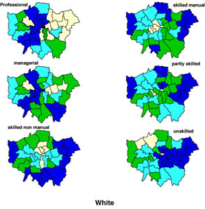
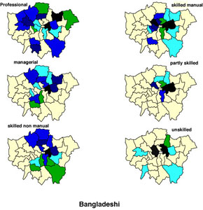
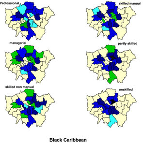
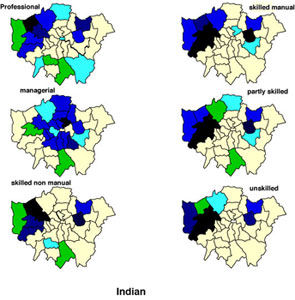
Illustration 5: Relative concentration of ethnic group (white, Bangladeshi, Black Caribbean and Indian) by social class, London 1991 (PETSIMERIS' own illustration)16) [33]
Using location quotients17) to map segregation, PETSIMERIS' analysis shows that Bangladeshis comprise the most segregated ethnic group across each of the socio-economic groups, while the White socio-economic classes are the least segregated (Illustration 5). One can see that there is a complex ethnic and social division of London, in which degrees of segregation are a function of both ethnic group and socio-economic group.
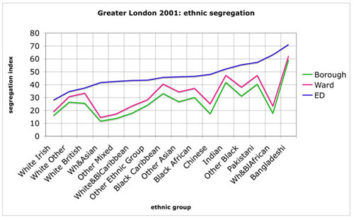
Illustration 6: Ethnic segregation by geographic scale, London 2001 (PETSIMERIS' own illustration) [34]
The combination of ethnic group and socio-economic group variables points to varying levels of segregation at the borough level. However, the availability of data on ethnic group at different scales helps point to the importance of scale when analyzing segregation. As Illustration 6 makes clear, the degree of segregation measured in terms of indices of segregation18) varies according to scale, furthermore the differences in scale for each ethnic group are not proportional (for further detail see BALL & PETSIMERIS, 2007). In the case of Bangladeshis, PETSIMERIS' complimentary analysis of segregation based on location quotients shows that the upper limit at borough level is 18.2 (Illustration 7) compared to 47.29 at the ward level (Illustration 8).
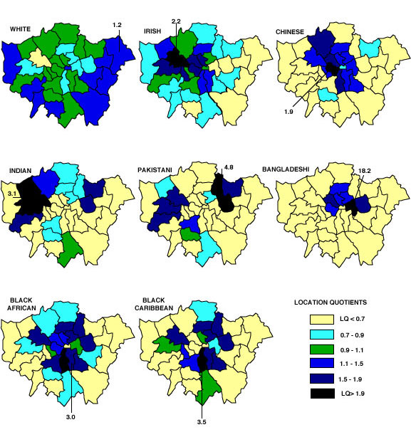
Illustration 7: Location quotient by ethnic group at borough level, London 1991 (PETSIMERIS' own illustration)
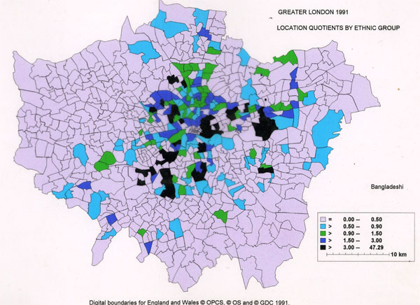
Illustration 8: Location quotients at ward level for Bangladeshis, London 1991 (PETSIMERIS' own illustration) [35]
Given that segregation by ethnic group is found to increase with increasing levels of spatial disaggregation, it is reasonable to suggest that segregation by ethnic group according to socio-economic group will follow a similar trend, with the lower social groups of the most segregated ethnic groups forming quasi ghetto clusters. In the absence of data for ethnic groups broken down by socio-economic group at any level below that of boroughs, it is not possible to test this hypothesis. [36]
From PETSIMERIS' analysis it emerges that there is not just a social division of space nor just an ethnic division of space, but a complex pattern of social division that forms complex spatialities, the details of which we are still guessing at. Although GIS has enabled progress to be made in the study of segregation through, for example, the application of SCHELLING's segregation model, data limitations are common to the maps of social division made at the end of the 19th century, in the 1920s and today. HARVEY's and BERTIN's warning that maps are only as good as the data on which they are based is all the more pertinent when we take into account David COLEMAN's recent advice to the House of Commons Treasury sub-Committee:
"All aspects of population statistics in the United Kingdom are in an unsatisfactory state. Even the base population remains uncertain. Despite every effort, the last two censuses have turned out to be unsatisfactory. Even the 2001 census, designed to be infallible, has had to be revised twice and its incompatibilities with other sources patched up with statistical Polyfilla. With present systems the degree of error is unknowable but possibly large. Inappropriate questions are asked, and necessary ones ignored. Immigration flow statistics are estimated on small voluntary samples of intended immigration and emigration, of incomplete coverage and high sampling error. Immigrants' destinations around the country are based initially on their stated intentions on arrival, naturally subject to revision. With these systems we cannot know who is in the country, legally or illegally, when they arrived, where they are or if and when they left. The number of illegal immigrants is anyone's guess although the government has given an estimate of about half a million. Internal migration and local population estimates are based on obsolete and often wrong census counts, sample surveys inadequate for local authority use and indirect and partial estimates from changes in doctors' registrations. Current huge migration flows quickly render estimates out of date" (2008, p.184). [37]
The multiculturalist policy context in which the classification of ethnic groups was drawn up feeds directly into the maps prepared by PETSIMERIS. His interpretation points to the complexity of the social division of urban space (PETSIMERIS, 1998). One among any number of alternative interpretations could be that these maps of London, by focusing on "ethnic" difference deny the real basis of much exclusion i.e. skin color, and do more to mask rather than uncover segregation in London. [38]
We started this paper by briefly introducing the "new map, new danger" position. While advances in technology may be leading to many more new maps, the "dangers" involved in their construction, production and interpretation are not new. By means of drawing on semiotics, geographers in the 1960s highlighted the dangers of data, context and interpretation. This paper has used a small sample of maps of social division in order to examine these dangers. [39]
In terms of the data on which they are based, BOOTH's maps of London are just as reliable/suspect as those based on the results of the 1991 and 2001 Censuses of Population. The school board officers' subjective assessments of each household's degree of poverty on a four point scale, checked against the second round of surveys BOOTH requested, may even be considered more reliable than the data derived from the modern Census's questionable categories and self-assessment approach. While the potential of interactive maps of social division is starting to be explored,19) like their nineteenth century counterparts, they will only be as good as the data on which they are based. [40]
All of the maps we have considered have been aimed at representing the social structure of urban space. Each has been conditioned by the context in which it was compiled, just as its interpretation—or the theory to which it may have given rise—is a reflection of the thinking of the time. HALBWACHS, for example, on his return to France drew on DURKHEIM to interpret his "ethnic map" of Chicago in terms of social class. [41]
The increasing use of maps in their various forms by a wide range of disciplines is an encouraging sign that a sensitivity towards space and place, or a "geographical imagination" (HARVEY, 1973) is being developed outside of geography. The spatial representation of social division in the form of maps has a long history, dating back to at least the seventh or sixth century BCE. While this history may be unfamiliar to most people, the cognitive and/or political use of any one or more of the large number of maps making up this history will have helped shape their understanding of social division. As maps and their making become more accessible to larger numbers of people, we can anticipate that they will continue to play an important role in constructing and testing knowledge20) of a variety of social phenomena, including social division. The changing nature of migratory flows, the partial coverage of existing population data, and the emerging "superdiversity" of many urban centers (VERTOVEC, 2007), mean that mapping urban social division will be a challenging task. When undertaking this task we hope that the map makers of the future—"neo," "paleo" or otherwise—will not forget the insights provided by geographers in the 1960s. [42]
The authors would like to thank the two anonymous reviewers for their time spent in reading and commenting valuably on an earlier draft of this article. We would also like to thank the University of Chicago Press, the British Library and Armand Colin for granting permission to use maps from their publications, and members of FQS for preparing the article for publication.
1) See http://thinkwhere.wordpress.com/2008/11/19/ for a critique of the new map, new danger position. See also http://blog.fortiusone.com/ and http://thinkwhere.wordpress.com/2008/09/18/paleogeography2dot0/ [Accessed May 14, 2010]. <back>
2) The pleasure many people derive from maps is evidenced by the ratings success of two BBC Four series about maps broadcast in April 2010 ("Maps: Power, Plunder and Possession" and "The Beauty of Maps"), http://www.guardian.co.uk/media/2010/apr/21/beauty-of-maps-bbc4, and the exhibition being held at the British Library ("Magnificent Maps," April 30 – September 19, 2010) [Accessed May 14, 2010]. <back>
3) In his consideration of the use of maps and mapping practices in contemporary geography, Chris PERKINS (2004) points to the paradox wherein the discipline of geography is overall becoming more visually aware at the same time that it is turning its attention away from maps. <back>
4) See CASTI (2005) for a review of this interpretative approach to the study of maps, and particularly the role of geography in its development. <back>
5) For images of both maps and a discussion of their accuracy see http://geography.about.com/library/weekly/aa030201a.htm [Accessed May 5, 2010]. <back>
6) Some of the work of DACEY, which HARVEY drew on in 1969, was later published in an article (DACEY, 1970). <back>
7) Fabianism describes a non-revolutionary, pragmatist tendency in English politics. Early members of the Fabian Society, including Beatrice POTTER who worked as a researcher for Charles BOOTH, aimed to exert political influence indirectly through marshaling empirical evidence and presenting it in policy-related publications. <back>
8) British Library Maps C.21 a.18.(295), SE sheet, copyright © The British Library Board. <back>
9) Black: class A; dark blue: class B; light blue: classes C and D; purple: classes C and D, with some E, F and B; pink: class F with some G; red: class G; yellow: class H. <back>
10) BURGESS (1925, p.55), copyright © University of Chicago Press. <back>
11) HALBWACHS (1984 [1932], p.300), copyright © Armand Colin. <back>
12) For a more detailed analysis of HALBWACHS' work on Chicago see TOPALOV (2007). <back>
13) The British Museum website notes that: "The map is sometimes taken as a serious example of ancient geography, but although the places are shown in their approximately correct positions, the real purpose of the map is to explain the Babylonian view of the mythological world." In this paper, the Babylonian map is being used not as an example of "ancient geography" (narrowly defined as spatial measurement) but as an example of the mapping of ethnic difference. See http://www.britishmuseum.org/explore/highlights/highlight_objects/me/m/map_of_the_world.aspx [Accessed: May, 11 2010]. <back>
14) Copyright © http://www.armenica.org/. <back>
15) The "New Commonwealth" refers to member countries of the Commonwealth of Nations who gained independence from Britain after 1947. When the term is used in reference to immigrants to Britain, it refers to persons from India, Bangladesh, the Caribbean and Pakistan, who are distinguished from immigrants from the "Old Commonwealth" or "the white dominions" of Australia, New Zealand, Canada and South Africa. <back>
16) Location quotients are represented by the following colors: yellow <0.7, light blue 0.7-0.9, green 0.9-1.1, blue 1.1-1.9, dark blue 2.0-3.0, black >3.0. <back>
17) A location quotient (LQ) is a relative concentration of a social group in space. An LQ of 1.0 signifies that the concentration of the social group in a neighborhood is similar to the metropolitan average for that group. LQs between 0.0 and 1.0 point to a relatively weak concentration, while values above 1.0 indicate multiples of the metropolitan average. For example, an LQ for Bangladeshis in one ward in London indicates that this group is 47 more times concentrated in this ward than would be expected if the group was evenly distributed across London. <back>
18) Indices of segregation measure the differentiation of one social group in comparison with all other social groups, and varies from 0.0 (uniform distribution of a group across space) to 100.0 (complete segregation from other social groups). <back>
19) Examples include community mapping projects in which residents—as opposed to "experts"—identify sites of deprivation, and propose policy alternatives. <back>
20) One example of how maps are being used to test/radicalize our understanding of concepts is provided by the website of Transit Migration with reference to thinking on borders, see http://www.transitmigration.org/migmap/ [Accessed: May 14, 2010]. <back>
Ball, Susan & Petsimeris, Petros (2007) Greater London: Cosmopolis ou cité de communautés? In Antonio Da Cunha & Laurent Matthey (Eds.), La ville et l'urbain: des saviors émergents (pp.341-356). Lausanne: Presses Polytechniques et Universitaires Romandes.
Barber, Peter (Ed.) (2005). The map book. London: Weidenfeld and Nicolson.
Berry, Brian & Kasarda, John (1977). Contemporary urban ecology. New York: Collier Macmillan.
Bertin, Jacques (1967). Semiologie graphique: les diagrammes, les résaux et les cartes. Paris: Mouton, Gathier-Villars.
Booth, Charles (1888). Conditions and occupations of the people in East London and Hackney, 1887. Journal of the Royal Statistical Society, 51, 227-245.
Booth, Charles (1889). Life and labour of the people (Vols. 1 and 2). London: Macmillan (republished 1969).
Bulmer, Martin (1984). The Chicago School of Sociology: Institutionalization, diversity, and the rise of sociological research. Chicago: University of Chicago Press.
Burgess, Ernest W. (1984 [1925]). The growth of the city. An introduction to a research project. In Robert E. Park, Ernest W. Burgess & Roderick D. McKenzie (Eds.), The city (pp.47-62). Chicago: University of Chicago Press.
Casti, Emanuela (2005). Towards a theory of interpretation: Cartographic semiosis. Cartographica, 40(3), 1-16.
Crampton, Jeremy W. (2009). Cartography: Performative, participatory, political. Progress in Human Geography, 33(6), 840-848.
Coleman, David (2008) Time for a fresh start: The case for a UK Population Register. Submission to the enquiry on Counting the Population, House of Commons Treasury sub-Committee. In House of Commons Treasury Committee, Counting the Population. HC 183-II Written Evidence (Vol.II, pp.184-197). London: the Stationery Office.
Cosgrove, Denis (2008). Geography and vision: Seeing, imagining and representing the world. London: I.B.Tauris.
Dacey, Michael (1970). Linguistic aspects of maps and geographic information. Ontario Geography, 5, 71-80.
Davies, Wayne (1984). Factorial ecology. Aldershot: Gower.
Davis, Mike (1999). Ecology of fear: Los Angeles and the imagination of disaster. London: Picador.
Du Bois, William E.B. (1967 [1899]). The Philadelphia negro: A social study. New York: B.Blom.
Grafmeyer, Yves & Joseph, Isaac (Eds.) (1984). L'école de Chicago. Naissance de l’écologie urbaine (A collection of texts translated and presented by Y. Grafmeyer & I. Joseph). Paris: Aubier Montaigne.
Halbwachs, Maurice (1984 [1932]). Chicago, experience ethnique. In Yves Grafmeyer & Isaac Joseph (Eds.), L'école de Chicago: naissance de l'écologie urbaine (pp.279-327). Paris: Aubier Montaigne.
Harley, J. Brian & Woodward, David (Eds) (1987). The history of cartography: Volume 1, Cartography in prehistoric, ancient, and medieval Europe and the Mediterranean. Chicago: University of Chicago Press.
Harley, J. Brian (1989). Deconstructing the map. Cartographica, 26(2), 1-20.
Harley, J. Brian (1990). Cartography, ethics, and social theory. Cartographica, 27(2), 1-23.
Harvey, David (1969). Explanation in geography. London: Edward Arnold.
Harvey, David (1973). Social justice and the city. London: Edward Arnold.
Howard, Ebenezer (1898). To-morrow: A peaceful path to real reform. London: Swan Sonnenschein.
Jones, Emrys (1966). Towns and cities. Oxford: Oxford University Press.
Office for National Statistics (2007). Ethnic group, national identity, religion and language consultation: experts, community and special interest group responses to the 2011 Census stakeholders consultation 2006/07. London: Office for National Statistics.
Palsky, Gilles (1996). Des Chiffres et des cartes: naissance et développement de la cartographie quantitative française au XIX siècle. Paris: Comité des travaux historiques et scientifiques, Mémoires de la section de géographie, 19.
Park, Robert; Ernest W. Burgess & Roderick D. McKenzie (1984 [1925]). The city. Chicago: University of Chicago Press.
Perkins, Chris (2004). Cartography—cultures of mapping: power in practice. Progress in Human Geography, 28(3), 381-391.
Quinn, James A. (1940). The Burgess zonal hypothesis and its critics. American Sociological Review, 5(2), 210-218.
Sauer, Carll O. (1963). Land and life a selection from the the writings of Carl Ortwin Sauer (ed. by J.B. Leighley). Berkeley: University of California Press.
Saunders, Peter (1981). Social theory and the urban question. London: Hutchinson.
Smith, Dennis (1988). The Chicago School: A liberal critique of capitalism. London: Palgrave Macmillan.
Topalov, Christian (2007). La ville lieu de l'assimilation sociale? In Marie Jaisson & Christian Baudelot (Eds.), Maurice Halbwachs, sociologue retrouvé (pp.87-101). Paris: Éditions ENS Rue d'Ulm.
Vertovec, Steve (2007). The emergence of superdiversity in Britain. Ethnic and Racial Studies, 30(6), 1024-1054.
Warf, Barney & Arias, Santa (Eds.) (2009). The spatial turn: Interdisciplinary perspectives. Abingdon: Routledge.
Susan BALL is senior lecturer in contemporary British civilization, Department of English, University of Paris 8, and researcher in the group EA1569 "Transferts critiques et dynamiques des savoirs" (domaine Anglophone). Her areas of research include urban policy, policy for the built heritage, and urban segregation.
Contact:
Susan Ball
DEPA, UFR5
Université Paris 8
2 rue de la Liberté
93526 St-Denis
France
E-mail: s.ball@wanadoo.fr
Petros PETSIMERIS is professor of human geography, Institute of Geography, University Paris 1, Panthéon-Sorbonne, and a researcher in the group UMR8504 CNRS "Géographie-cités." His areas of research are processes of urbanization, social division of space and gentrification in Europe.
Contact:
Petros Petsimeris
UFR de Géographie
Université Paris 1
191 rue Saint-Jacques
75005 Paris
France
E-mail: petros.petsimeris@wanadoo.fr
Ball, Susan & Petsimeris, Petros (2010). Mapping Urban Social Divisions [42 paragraphs]. Forum Qualitative Sozialforschung / Forum: Qualitative Social Research, 11(2), Art. 37, http://nbn-resolving.de/urn:nbn:de:0114-fqs1002372.

Creative Commons Attribution 4.0 International License